Vente is an app that provides personalized updated information to save time and hassle to find different events based on user’s interests from the local community from all over the world.
Roles & Responsibility
Role: UI Designer, Graphic Designer.
Responsibility: User Research, Visual Identity, Moodboard, Style Tile, Design principles, UI design & Prototype.
Duration: 6 weeks , Oct 2019.
Tools: Adobe Illustrator, Adobe Indesign, Sketch, Invision, Miro.
Context
There are few events apps available in the market but not all apps provided personalization and leads to large amount of content which user might not be interested in. Whereas Vente is a great tool for local or a traveler to who wants to discover the current events and meetups, niche to their interests but don’t know where to explore for for or where to go. It is niche to individual’s personal interests and behavior with target content.
Events Industry in UK
The events sector is worth £42.3 billion to the UK economy in terms of direct spend by event delegates, attendees and organisers, an 8% rise on the previous year. A substantially higher figure is achieved once the wider economic impacts (indirect and induced spend plus accompanying persons’ spend) are included. The spend by those accompanying attendees at business events is worth an additional £7.7 billion.
Challenge
The local scene is experiencing an overload of shareable information. Today’s consumers are over saturated with local events, meetups, and group activities. Despite the endless sea of happenings, people continue their struggle to find activities that align with their personal interests.
User Persona
AMY GRANT / City Lover
During the day Amy is a project manager at a small tech startup. When she is not working she loves to explore the city. attend local events and maintain a healthy lifestyle.
Motivation : Have fun and stay Healthy
Goal : Stay active and up to date
Frustration : Lack of time to search for local events.
NATE YOUNG / Event Junkie
Nate writes for a local magazine. The city scene is his passion. he loves writing about the community, music, ongoing events and health.
Motivation : Staying current with the local scene
Goal : Get a complete scoop on local classes, events and meetups.
Frustration : Too much happening at once locally.
Competitive Analysis
The branding is bold and having own personality.
Well balanced white space.
Very well defined interests, Categories and subcategories.
There is no rating or reviews for events.
The branding is logotype keeping it traditional.
The app has no white space and the filled with large images.
Two different ratings for each activity : one by Time Out and another by users.
The branding is pleasant and contemporary.
Doesn’t really provide personalisation.
Well balanced white space.
There is no rating or reviews for events
Goal
Vente as a brand needs a make product for the target audience to discover events or meetups that are adjusted to the individual intrigued and make it niche.
Strategy
The product must be designed by emphasizes. on personalization and right amount of content display which is minimal yet inspiring visual with utilizing clean & modern typography and color tone that represent each energy & boldness to urge out and explore.
Wireframes Evaluation
The provided wireframes helped me to understand the main pain points users are facing. It also have me an idea for the. visual appeal of the app. The wire frame has main basic screens to understand the navigation and user flow but some of the screens can be rearranged for the the easy and intuitive user flow. It has the realistic copy and no dummy text showcases the tone and voice of the app. There is a detailed onboarding flow with success message whereas login flow has two similar screen that might lead users into confusion. Adding fingerprint / face login would make process more intuitive and fast. The screens containing alerts and find events are in empty states. having a screen layout makes it more easier to comprehend.
Design Process
Design Principles
Mood Board
I started the mood board with brainstorming. As i was working on an event app which can involve almost all possible activities an individual can do based on their interest. I thought of the key three different aspects for an event: Fun, Focused and Personal. These keywords helped me to derive the adjectives like playful, minimal and luxury.
My love for minimalism art and movement rightly align with the user needs to have a concise and personalised data. I had lots of visuals for the same, but I chose the ones that represent in the context of the event app. The layout is breathable with a balanced amount of white space with neutral colour images.
Style Tile
The style tiles I drafted keeping in mind the layout as the key element that represents the visual identity of the product. The minimal style tile showcases the warm colors that are passionate and friendly and elegant typeface for modern appeal.
Logo Usage
There are two versions of the logo, a Logomark and Logomark with text. They can be used interchangeably. One logo might be used more than the other, depending on the platform and background color or Texture.
Colors & Texture
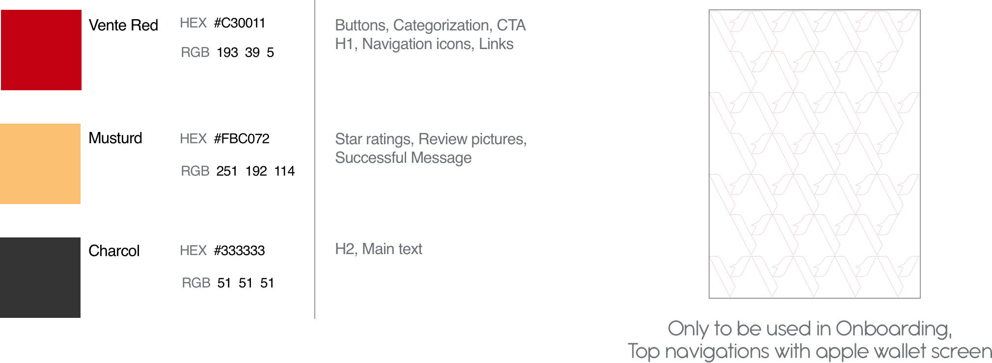
The color story for the branding is warm and passionate color that I named Vente red & Mustard.Charcoal being one of the versatile colors that can be used for the text across the app. The texture is created from the logo itself makes it a monogram, gives brand a strong sense of identity with modern appeal.
Iconography
The Iconography for the product is linear and minimal keeping in mind the design principles.
Typography
User Journey Flows
Prototype
Responsive Marketing Website
For responsive marketing website, first I did some research on the different marketing websites of brands as well as event-based apps. I started with sketching some ideas based on what one marketing website should include. I wanted the website to show the similar aesthetics as the Vente app to keep it minimal and clean but make it look exclusive and posh.
Conclusion
In the course of my training, I learnt how important it was to follow a user-centered design process and this project further solidified that thinking. Not just designing user interface but also creating a strong visual identity. This project has also allowed me to create responsive design for marketing website and made me understand the way interaction works on different platforms.


