A personalised healthy recipe app that focuses on time, affordability and knowledge.
ROLES &
DELIVERABLES
Role: UX / UI Designer
Team: Ida Dyberg, Femi Olupo, Lindy Young and myself
Duration: 8 weeks, Sprints
Deliverables: User Research, Domain Research, User interviews and testing, User journey, Design principles, Mid to High Fidelity screens & Prototype, Micro Interactions.
PROJECT
OVERVIEW
Füdent is developing a mobile health app to help young adults adapt their health to their lifestyle. Using machine learning and psychology, the user’s data will connect the 3 pillars of health (food, exercise and mindfulness) to provide a unified and personalized health experience. The app will help users achieve a complete and balanced approach to health, specific to their lifestyle, time, and budget.
The team was approached by Füdent to work on one of the three pillars of Food. We developed the strategy to figure out what kind of features this app needed to have to successfully overcome the barriers of Time, affordability and Knowledge and make healthier lifestyle choices. This case study is a journey on how I used the design process to explore this aspect.
PROJECT
CHALLENGE
“To encourage young adults ( Millennials ) to overcome the barriers and make healthier lifestyle choices.”
PROJECT
STRATEGY
Our strategy for the project was classic double diamond design methodology. The first phase was Discovery, we immersed ourselves in research and talk to users and try to understand rather than simply assume, what the problem is. The insights gathered from the discovery phase helped us with the second phase to Define pain points and challenges. Moving on with the second diamond we start exploring different ideas and concepts for design and Develop Mid to High Fidelity screens and Prototype which was ready to Deliver for testing.
Guerilla
TESTING
The team did guerilla testing with 6 users of the existing prototype to gain consensus and validate the hypothesis from the Client’s side.
Existing MVP
Guerilla testing suggested that the existing application is more of a cooking app than a health app.
Thought it was a cooking / Recipe app.
Could not see the connection to health.
Didn’t understand the difference between reviews and ratings.
Didn’t notice the direction on the CTA’s as they were not clear.
Liked the clear bottom navigation.
Liked the step by step pictures for the recipe.
USER
INTERVIEWS & SURVEY
To gain more insights into user needs, pain points and motivations we conducted a survey and various user interviews over a three days period. We collected the relevant data and synthesised that helped us with the next steps.
User interviews
Most users lack time
“I like cooking but can't be bothered to cook for long after a long day of work.”
“I think I don’t have time to just get all these ingredients. And in the end, it'll taste amazing but you spend three hours in the kitchen and it's just, it's a real process.”
User survey participants
Perceptions of Health
36% have a holistic view of health
31% would like to lose weight
Cooking & Diets
52% Of users would like recipe discovery
88% spends less than an hour cooking a meal
KEY
TAKEAWAYS
Surveys and User interviews suggested that the majority of the Millenials wants to have a healthier lifestyle and keen to learn cooking and some of them really enjoys it.
Some of the Millenials feel that they don’t have enough knowledge or skills to cook and lack time, money and would like to have an easy source where they can learn to cook and track their health.
Many of the participants showcased that it’s very difficult to track health as the existing apps are complex and have a tedious process. some of the apps are overwhelming with many choices and lacks personalization.
We also found that rewards and recognition are big factors for motivation for the users.
COMPETITIVE
ANALYSIS
We did an extensive competitive analysis of the direct and indirect competitors existing in the market. We focused on key features and GUI patterns that gave us a detailed approach to incorporate in the Füdent.
USER
PERSONA
Based on the Research insights, User Interviews and Surveys, we created a user persona Bobbi Baker, a 23-year-old young millennial. She is currently studying and working Part-time and has a limited disposable income. She wants to have a healthier lifestyle but lack time and knowledge.
Bobbi Baker / / Student
Age: 23 Gender: Female Dietary Restriction: Diabetic type 2 Disposable income a month: £100 Occupation: Study / Works part time Residence: UK Relationship Status: In a relationship
““I want to be healthier but I am busy, I don’t have enough time or money searching for information.”
”
PROBLEM
STATEMENT
Millennials starting out, need an affordable way to manage their health because they have busy lives and do not have enough knowledge or time.
USER JOURNEY
MAPPING
During several workshops, we start to work on the story mapping of Füdent, to have a better vision and understanding of the features to work and implement. We prioritized four features and user journeys that are Onboarding, Recipe Discovery, Tutorials and Tracking to be worked for the MVP.
Crazy 8 workshop with client.
User flow ideas presentation.
KEY
FEATURES
1. ONBOARDING
Put in basic information Height, weight etc.
Image, avatar
Diet Restrictions
3. TRACKING
Set Goals
Plan meals
Track health
2. RECIPE DISCOVERY
Find recipe to eat
My Fridge
Personalization
4. TUTORIAL
Contextual cooking skills
Develop/Improve skills
Rewards
MID FIDELITY
WIREFRAMES
We created the first round of mid-fidelity wireframe screens for usability testing with potential users. The objective of this testing was to find out the pain points and struggle in the user flow, test the features and elements like CTA, Labels, Icons etc.
USER TESTING
OUTCOME
Through usability testing, we realised that there were few problems with the user flows and icons. some of the users couldn’t recognise the gender icons, whereas some of the participants were not confident with the user journeys and couldn’t complete the set tasks on some of the screens that led us to iterate further and change the taxonomy. we also got some positive feedback on few screens and that the app was for a personalised healthy recipe app.
User Testing
“I could see everything I need to know. Goals were completely highlighted and added a new goal with a plus button. Checking statistics were very easy to do.”
“There is a high level of personalisation. Likes that you can cater to what you have and what you want.”
MID FIDELITY FINAL
WIREFRAMES
ONBOARDING
Onboarding has been a debatable topic for a long in terms of time spent by the user to complete. In our interviews and surveys, we discovered that users don’t want to spend too much time providing data. Users were keen to directly jump into the app and explore. We decided to have progressive onboarding where user can directly access the content of the app and keep building their profile on their own time.
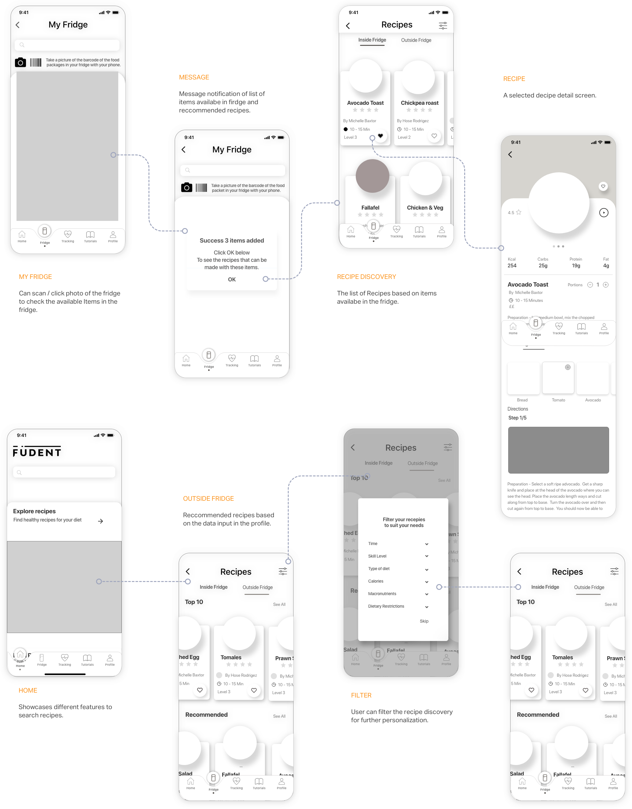
Recipe Discovery can be done in two ways. My fridge is an AI feature where users can scan the fridge to check the available items in the fridge and gets recipe recommendations based on the items scanned. Whereas in Home users can find recipes easily based on their preferences. The users can filter the recipes further if they feel overwhelmed by a lot of options.
RECIPE
We realised from the research insights and user interviews that many users are keen to learn and enhance their skills. Tutorials were one of the key feature providing knowledge to the users through guided step by step and video tutorials. Users can earn and collect badges after finishing each section as it was a motivation factor.
TUTORIALS
The tracking feature allows users to track their goals and plan meals. User can select the goals from the preselected list. Based on the data input in the profile, users are suggested a defined goal that user can customise before finalising. Users can check their progress in detail by daily, weekly and monthly selection.
TRACKING
MEAL PLANNING
Meal planning is a feature part of Tracking. It allows users to plan their meal well in advance based on their dietary preferences and calories intake. User can add recent meals or search to add into daily meal intake. Users can also check a detailed breakdown of the calories intake per day.
DESIGN
PRINCIPLES
The Design Principles are fundamental pieces of advice that help to produce easy to use and pleasurable design. Through our research and user interviews, we came up with 20-25 design principles that can be used for the health and food industry for an intuitive and accessible product. We did a priority matrix workshop to finalise 5 key design principles that can lead and help us with the design process and final outcome.
STYLE
TILE
After having mid-fidelity screens and design principles ready, we were ready to start developing concepts for the Visual language of the product. We developed divergent style tiles to explore the different look and feel for the product. The vibrant style tile was fun, colourful, minimal yet glanceable.
Warm Delight
DESIGN SYSTEM
TYPOGRAPHY
The typeface used across the platform is sans serif to give a clean and modern look to the overall aesthetics of the application. It is used in different weights to maintain consistency and hierarchy.
COLOURS
Keeping in mind the colour theory the team decided to use a warm and bright combination of colours to help to focus on content. High-quality content of recipes, tutorials and tracking health make the app look modern and maintain seamless usability.
HI-FIDELITY
SCREENS
Implementing user testing insights, we developed high-fidelity screens of the four user journeys: Onboarding, Recipe discovery, Tutorials and Tracking. That helps to solve the main three pain points which are, Time: by filtering recipe time, Affordability: each recipe showcases the average amount of money and Knowledge: through different skill and knowledge-based tutorials.
FINAL
PROTOTYPE
CLIENT
TESTIMONIAL
“You guys have worked ridiculously hard and produced 10-fold what the MVP was” : Stef Hajipieris, Co-founder Füdent
“You’ve built the foundations and the scaffolding and gone on to complete the exterior of the house! You’ve done really well to pull all of yours and our ideas together and to produce something amazing” Tom Timotheou, Co founder Füdent
THOUGHTS, RESULTS AND
LESSONS LEARNED
Working on this project, I have learned so much and by far the most in-depth project I have worked on. I had the chance to work with an amazing team, which made Füdent possible. If you are reading this, thanks to all of you guys.
I have learned that no matter the size of the company and the limitations one think it could have, if you are bold enough to push your ideas, and can back it up with logic and creativity, it can work. I have remembered that no matter how good an idea or feature can look, it will always be the user who is the final judge on that, not you.


