Gorilla Charts is an employee performance dashboard system.
Roles & Responsibility
UI Designer
User Research, User interviews and testing, Art Direction, Design principles, Wireframes, UI design & Prototype.
Team
Ben Harrison Emi Bulai Piyush B.
Duration
6 weeks Oct 2019
Overview
Gorilla graphs is a customer feedback platform to help retailers to measure individual associate performance through those ratings and pre-populated tags that are aligned with specific customer service goals and behaviours defined by the retailers. Ultimately, this data will offer actionable insights that retail managers can leverage to better coach and train associates, improving their overall customer service strategy.
However, I have noticed a few pain-point that lower the quality of user experience with the product. Those are limited features ( such as an inability to see analytics data in a comparison to a previous period ), obsolete interface design, and lack of decent mobile version. This case study walks you through the process of fixing those limitations by redesigning one of the most important pages for retails managers.
Problem Statement
“Lack of a dynamic interface makes it difficult for retail managers to identify customer feedback analytics and clearly examine areas of improvement between customer experience and sales.”
Scope of Work
User Personas
Victoria Ryan
Regional Director, Bare Minerals NY
Jackie Win
Boutique Manager, Bare Minerals NY
Needs:
Looking to create a benchmark to measure Store’s Performance
Needs a way to easily pinpoint weaknesses in Store.
Needs:
Looking for a Glanceable way to digest employee & Store performance.
Wants a way to measure customer feedback that is specific and actionable.
Domain Research
Competitive Analysis
Portrait images with lot of illustrations.
Simples, fun and modern with enough white space
Charts & Graphs in vibrant colors as its in dark mode.
Well organised with good use of space and cards.
Overall Friendly with good use of cool colors.
Professional, Minimal and organised with good use of grid.
Wireframes Evaluation
The team has been provided with the mid-fidelity wireframes which I tested with the subject matter experts to gain more insights. The annotated wireframes are the suggestions taken into consideration based on the SME interviews to make the interface intuitive and user friendly.
Desktop / Tablet
Mobile
The same recommendations are applicable to mobile version as well for consistency.
Design Principles
Style Tile
Logo Usage
There are two versions of the logo, a Logomark and Logomark with text. They can be used interchangeably. One logo might be used more than the other, depending on the platform and background color or Texture.
Colors
The complementary colors are used to enhance the data with color coding. Apart from this Orange is the brand color which is used in main navigation bar. Charcoal and gray is used for the type based content. Gradient colors are to be used only for the charts to make interface engaging and dynamic.
Iconography
Iconography across the interface is linear and minimal. keeping in mind the design principles. the. change in colors showcases the difference between Inactive and active icons.
Typography
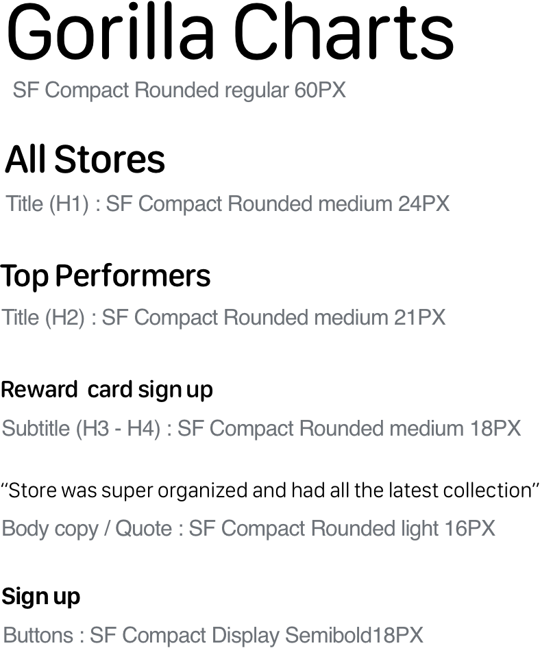
Sans Serif typeface used to have modern appeal with clear accessibility. SF compact rounded typeface is used as the rounded edges looks more friendlier and less intimidating.
Hi-Fidelity Screens
Desktop / Tablet
Mobile
Gorilla Charts : Prototype
Takeaway
When it comes to a project, I felt it is much better to work in a team rather than as an individual. While working in a team, it is easier for us to brainstorm different ideas and give each other constructive feedbacks which is a rather hard thing to do while you are working individually.
Another thing I noticed was that we didn’t just work on our base idea but also tried to solve problems faced by the users. We might add a lot of new features to our product, the base idea would always be the same, that’s what I learnt.
Lastly, I learnt that we need to take input from someone isn’t that part of your team and having SME to interview and test is crucial because we, as a designer, might think we know what exactly is best for the user but that is not true. That’s why an outsider’s opinion is needed.


